Did you know that 75% of resumes are eliminated by an Applicant Tracking System before a human recruiter ever sees them? You've spent years mastering complex tech stacks, yet your career progression often hinges on whether a machine can read a specific typeface. It’s frustrating to watch your applications vanish into a digital black hole simply because you chose a "unique" design over technical compatibility. Finding the best font for ats resume isn't about personal style; it's about optimizing your data for the AI-driven parsers that dominate the 2026 hiring landscape.
We understand that your time is your most valuable asset. You need a resume that functions like high-performance code: clean, efficient, and error-free. This guide eliminates the conflicting advice by providing a definitive list of fonts that pass the machine-reading test with maximum accuracy. You'll learn how to leverage specific typography to ensure your skills are indexed correctly by systems like Greenhouse, Ashby, and Lever.
We'll break down the top 10 safe fonts, establish clear sizing rules for body text and headings, and reveal the layout adjustments required for modern AI scoring. It's time to stop guessing and start using a resume format built for speed and visibility.
Key Takeaways
- Eliminate parsing errors by avoiding decorative fonts with overlapping ligatures that confuse modern OCR systems.
- Deploy the best font for ats resume using 2026 standards like Aptos to ensure maximum readability for AI-driven hiring platforms.
- Implement a consistent font hierarchy to help parsers accurately categorize your technical skill sets and career milestones.
- Bypass technical bottlenecks by removing columns, tables, and graphics that often result in scrambled text strings during the extraction process.
- Accelerate your job search by automating the tailoring process once your document's technical foundation is fully optimized.
Parsing the Machine: Why Your Font Choice Dictates Your Reach
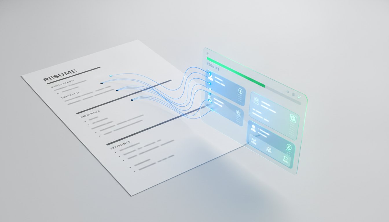
Your resume is a data packet. If the receiver can't decrypt it, you're out. An Applicant Tracking System (ATS) uses Optical Character Recognition (OCR) to translate your PDF or Docx file into structured data. When you choose an overly decorative typeface, you aren't showing personality; you're creating technical debt. Modern hiring systems prioritize clarity over creativity. If the machine can't map your characters to its database, your experience effectively doesn't exist.
The Technical Anatomy of an ATS-Friendly Font
Legacy parsers rely on standardized glyphs. If a character shape is too unique, the system misidentifies it. Kerning, or the spacing between characters, also plays a critical role. If your font has inconsistent spacing, the OCR might merge two letters into one non-existent character. You must stick to web-safe options. Never use a custom font that requires a separate download or embed code. If the system doesn't have the font locally, it will substitute it. This substitution often breaks your layout and tanks your match score. Efficiency requires using what the system already knows.
Serif vs. Sans-Serif in 2026
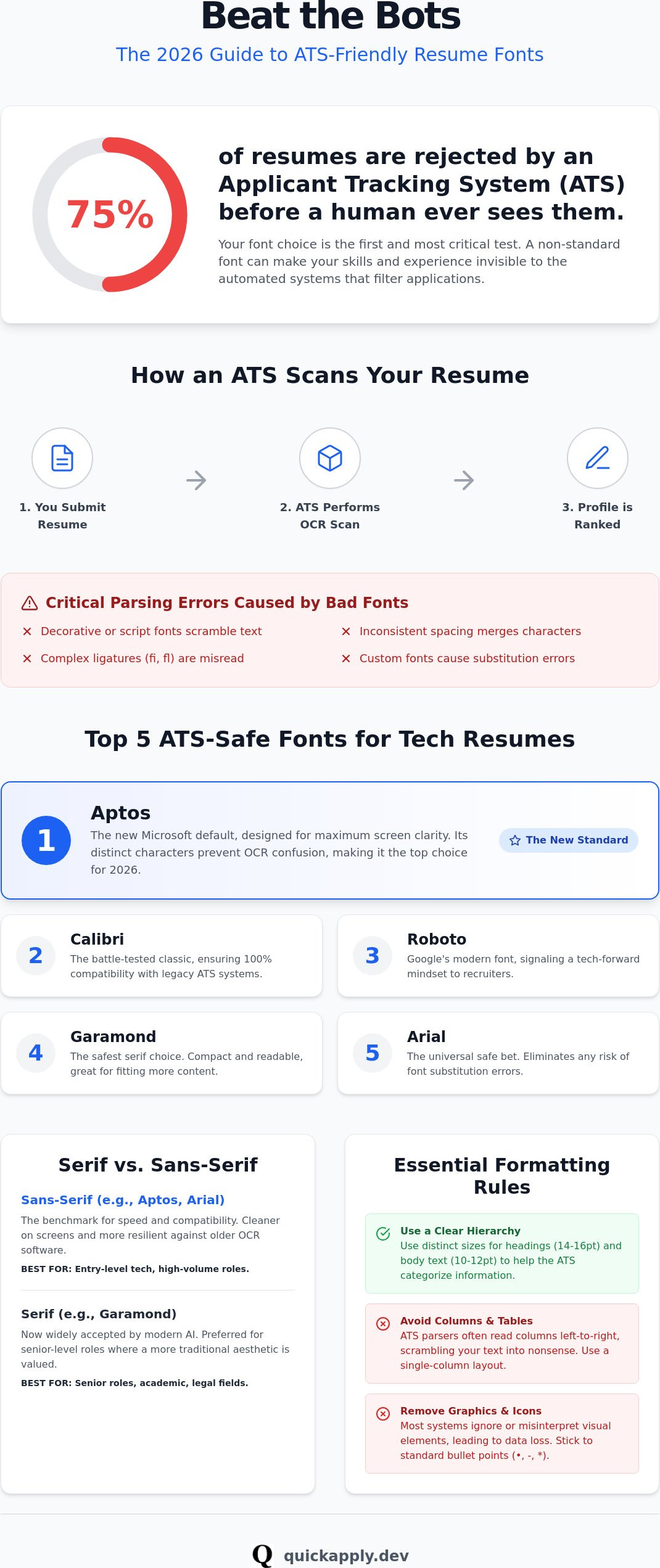
By 2026, sophisticated AI systems have become better at reading serif fonts like Garamond or Georgia. These are now widely accepted for senior-level roles where a traditional aesthetic is preferred. However, sans-serif options like Calibri or Arial remain the benchmark for high-speed corporate parsing. They are cleaner on screens and more resilient against older OCR software. If you're applying for entry-level tech roles or high-volume positions, prioritize sans-serif to eliminate any margin for error. Optimization isn't about being pretty. It's about being readable for the algorithms that guard the gate.
The Top 5 ATS-Friendly Fonts for Tech Resumes in 2026
Selecting the best font for ats resume isn't a stylistic choice. It's a strategic one. In 2026, the landscape has shifted. We've moved beyond generic recommendations to a data-driven hierarchy of typefaces that ensure your technical expertise is never lost in translation. These five fonts represent the gold standard for high-performance applications.
- Aptos: The new Microsoft flagship. It’s designed for high-resolution screens and features open counters that make it nearly impossible for a parser to misread.
- Calibri: The former default remains a powerhouse. It is the most tested font in recruitment history and offers a 100% success rate with legacy systems.
- Roboto: Developed by Google, this font feels native to software environments. It signals a modern, tech-literate mindset to both machines and human recruiters.
- Garamond: If you must use a serif, this is the only logical choice. It’s compact, allowing you to fit more high-impact data on a single page without sacrificing readability.
- Arial: The universal safe bet. It’s pre-installed on every system globally, eliminating any risk of font substitution errors.
Recruitment experts at Indeed suggest that using the best resume fonts is the simplest way to improve your document's visibility. Efficiency starts with the basics. If you want to ensure your layout is as sharp as your font choice, consider using resume tailoring to align your technical content with 2026 standards.
Aptos: The New King of Readability
Aptos recently replaced Calibri as the default in Microsoft 365, marking a significant shift in professional standards. Its design focuses on clarity. The distinct shapes of characters like "l," "i," and "1" prevent the OCR confusion that plagues older typefaces. If you’re targeting high-growth tech startups or FAANG companies, Aptos shows you’re operating on the latest stack. It looks sharp, parses perfectly, and maximizes white space.
Roboto and Montserrat: The Designer's Choice
Tech-centric companies often prefer geometric sans-serifs like Roboto or Montserrat. These fonts mirror the clean UI/UX of modern web applications. They provide a high-readability experience that appeals to engineering managers. However, you must be careful with weights. Avoid ultra-light or ultra-bold versions. These weights can blur during the parsing process, leading to garbled text strings. Stick to "Regular" or "Medium" to maintain a modern aesthetic while staying 100% ATS-compliant. Consistency is the key to passing the machine-reading test.
Font Hierarchy and Sizing: Optimizing for Human and Machine
Modern AI parsers don't just read text; they perform data chunking. They look for visual cues to map your content into specific database fields like "Job Title" or "Technical Skills." Without a distinct hierarchy, the parser sees a flat file. This structural ambiguity leads to miscategorized experience and a lower relevance score. Even when you've selected the best font for ats resume, a lack of structural contrast will confuse the algorithm. You need to treat your resume layout like a well-organized codebase.
Consistency is your primary tool for optimization. Standardize your margins at exactly one inch on all sides. This creates a predictable coordinate system for the OCR software to follow. When you deviate from standard margins, you risk the parser cutting off the ends of sentences or skipping entire lines. Use bolding with surgical precision. It should highlight key performance metrics and data points, not entire sentences. Excessive bolding creates visual noise that can interfere with character recognition during the scan.
The 2026 Sizing Standard
Your name should serve as the primary anchor of the document, sized between 18 and 24 points. This ensures the system identifies the file owner immediately. Section headers require a size of 12 to 14 points. Use bolding or all-caps for these headers to act as clear delimiters for the AI. For the body text, stay within the 10 to 12 point range. Never drop below 10 points. Smaller sizes lead to character bleeding, where letters overlap and become unreadable to the parser. Choosing the best font for ats resume is only half the battle; you must also manage the scale to maintain data integrity.
White Space and Line Spacing
Efficiency dictates how you use your vertical real estate. Aim for 1.0 or 1.15 line spacing. This provides enough breathing room for a clean OCR path without wasting space. Avoid double-spacing at all costs. It forces your resume onto multiple pages, which can lead to fragmented data extraction. Use intentional white space to separate major sections like "Experience" and "Education." This gap acts as a "stop" command for the parser, signaling that one data set has ended and another is beginning. Clear separation prevents the system from merging unrelated job titles or dates, keeping your profile's logic intact.
Formatting Errors That Break ATS Parsers
Even the best font for ats resume can't save a document with a broken layout. Formatting errors are the silent killers of technical applications. While you might think a complex layout looks sophisticated, a machine sees it as an unparseable mess. Logic and linear flow are the only things that matter to an algorithm. If the parser can't follow your document's path, your data remains unindexed and invisible.
Headers and footers are a major point of failure. Most enterprise-level parsers are programmed to skip these areas to avoid repeating contact info on every page. If you place your LinkedIn URL or phone number in the header, the system might never index them. Keep all critical data in the main body of the document. Similarly, custom fonts present a high risk. When software encounters a missing font, it substitutes a generic alternative. This shift often causes text to overlap or overflow, destroying the hierarchy you worked to establish. Using the best font for ats resume means sticking to standardized options that every system recognizes.
The Column Trap
Two-column resumes are the primary cause of parsing failures in 2026. Most OCR software reads from left to right across the entire page. In a multi-column layout, the machine often merges the content of both columns into a single, nonsensical string of text. Your current job title might get merged with a hobby or a sidebar skill. Stick to a single-column layout to maintain maximum data integrity. You can find high-performance, single-column templates in our guide to good resume examples.
Images and Non-Text Elements
Graphics, icons, and skill bars are invisible to an ATS. A phone icon meant to look professional often renders as a garbled Unicode character that breaks the contact field. Headshots are equally problematic; they can trigger compliance filters in many automated systems, leading to an immediate skip. Don't try to game the system with "invisible" text or keyword stuffing in white font. Modern AI-driven parsers detect these tactics instantly and flag the profile for rejection. Focus on tailoring your resume to a job description with high-impact, readable text instead of visual gimmicks.
If you want to ensure your layout is machine-readable while maximizing your match score, use resume tailoring to automate the optimization process and eliminate formatting risk.
Scale Your Search: Automating Your Resume Optimization
Your document is now a clean, high-performance data packet. By selecting the best font for ats resume and purging formatting errors, you've cleared the technical hurdles that stop 75% of candidates. However, machine readability is just the baseline. The real competition begins with relevance scoring. Modern systems score your experience based on contextual alignment with the job description. If you're still manually editing every bullet point, you're falling behind. Manual tailoring is a massive bottleneck in a market that moves at the speed of software. Efficiency is the only way to secure top-tier tech roles before the window of opportunity closes.
You need to treat your job search like a deployment pipeline. Selecting the best font for ats resume ensures your data is extracted, but content relevance is what triggers the hiring manager's notification. In 2026, the volume of applications means that only the top 5% of match scores receive human review. You cannot achieve that level of precision through manual effort alone. You need a system that optimizes for the algorithm while you focus on high-value tasks like networking and skill development.
Stop Building, Start Tailoring
QuickApply eliminates the manual labor of resume optimization. Our platform ensures your technical profile aligns perfectly with the specific requirements of every role you target. By adopting a tailor resume to job description ai workflow, you move from simple keyword matching to deep contextual relevance. This process ensures your skills are indexed with the highest possible match score. You no longer need to worry if you've missed a critical term. The system handles the alignment, allowing you to focus on the interview. Stop building resumes from scratch and start deploying them at scale.
Managing the Full Application Lifecycle
Managing a job search is a full-lifecycle engineering project. Once your resume is technically sound and contextually optimized, you need to track its performance across the web. Our application tracker provides the data you need to see which applications are converting. You can then leverage our interview practice and salary negotiation guide to close the deal. This is more than just a resume fix. It is a complete system for professional advancement. Join QuickApply today to automate your path to more interviews and gain a disruptive advantage in the 2026 job market.
Deploy Your 2026 Career Strategy
Your resume is now technically optimized for the modern web. By eliminating formatting debt and selecting the best font for ats resume, you've removed the structural barriers that cause 75% of applications to fail. You understand that machine readability is the prerequisite for human review. Clean typography and a single-column layout aren't just design choices; they are the protocols that ensure your data reaches the right database.
Structural integrity is only the first step toward a successful hire. To win in a high-volume market, you must transition from manual editing to systemic automation. This is where you gain your competitive edge. Optimize your resume for the ATS with QuickApply to leverage AI-powered match scoring and automated resume tailoring. Our integrated job application tracker monitors your progress while you focus on high-impact technical interviews.
Stop fighting the system and start using it to your advantage. You have the technical foundation to bypass the digital black hole. Take control of your professional trajectory today.
Frequently Asked Questions
Is Times New Roman still a good font for an ATS resume?
Times New Roman is technically readable but no longer the optimal choice for tech professionals. Its narrow serifs can cause character bleeding in older systems during low-resolution scans. You should prioritize cleaner, modern typefaces like Aptos or Calibri. These fonts offer better spacing and higher contrast for OCR parsers. In the competitive 2026 tech market, using an outdated font can signal a lack of technical currency to human recruiters.
Can ATS read bold and italicized text?
Modern ATS platforms can handle basic styling like bold and italics without issue. You should use bolding to emphasize data-driven achievements and job titles. Avoid using italics for large blocks of text. Italics can lean and overlap, which creates digital noise for sensitive OCR software. Maintain a clean hierarchy by using bolding sparingly to guide the machine toward your most relevant match data.
Should I save my resume as a PDF or a .docx for the best parsing?
PDF is the recommended format for nearly all modern systems including Greenhouse and Workday. It locks your formatting and ensures the best font for ats resume renders correctly on any device. Some legacy systems still prefer .docx, so always check the upload instructions. If no preference is stated, a high-quality PDF provides the most reliable data extraction for your technical profile.
Are sans-serif fonts better than serif fonts for tech jobs?
Sans-serif fonts are the preferred standard for tech roles in 2026. They offer a contemporary aesthetic that aligns with digital-first environments and high-resolution screens. While modern AI parsers can read serifs like Garamond, sans-serif fonts provide higher resilience against character recognition errors. Use Roboto or Arial to ensure your document feels native to the software systems that will process your application.
What is the best font size for a resume in 2026?
The 2026 standard requires 10 to 12 points for body text and 12 to 14 points for section headers. Your name should stand out at 18 to 24 points to act as a document anchor. Never use a font size below 10 points for your core experience. Small text leads to character bleeding, which garbles your data during the scan. Proper sizing ensures the parser distinguishes between your roles and your achievements.
Can I use icons for my phone and email on an ATS resume?
Avoid using icons for contact information. Graphics for phone, email, or LinkedIn often translate into broken Unicode characters during the parsing process. This creates a data gap in your profile. Use clear text labels to identify your contact details instead. Systems prioritize text-based data over visual symbols. Eliminating these non-text elements ensures your contact fields are populated correctly every time.
Does the font color matter for ATS readability?
Font color is a critical factor for OCR accuracy. Stick to black text on a white background to maximize contrast. Automated systems struggle with light colors or low-contrast backgrounds. Using colored text for headers might look modern to humans, but it risks being skipped by the machine. Optimization requires a high-contrast document that allows the parser to identify every character with 100% certainty.
How do I check if my resume font is ATS-friendly?
You can verify your document by performing a plain text test. Copy all the content from your resume and paste it into a basic text editor like Notepad. If the best font for ats resume you selected is truly compatible, the text will appear clean and organized. If the output contains symbols or merged words, your typeface is causing parsing errors. Fix these errors before submitting to avoid the digital black hole.


